The Classic Movie History Project Blogathon: Colour Design in «The Trail of the Lonesome Pine» (1936)

Of all God's gifts to the sighted man, colour is holiest, the most divine, the most solemn.
(John Ruskin, English art critic and writer, 1819-1900)
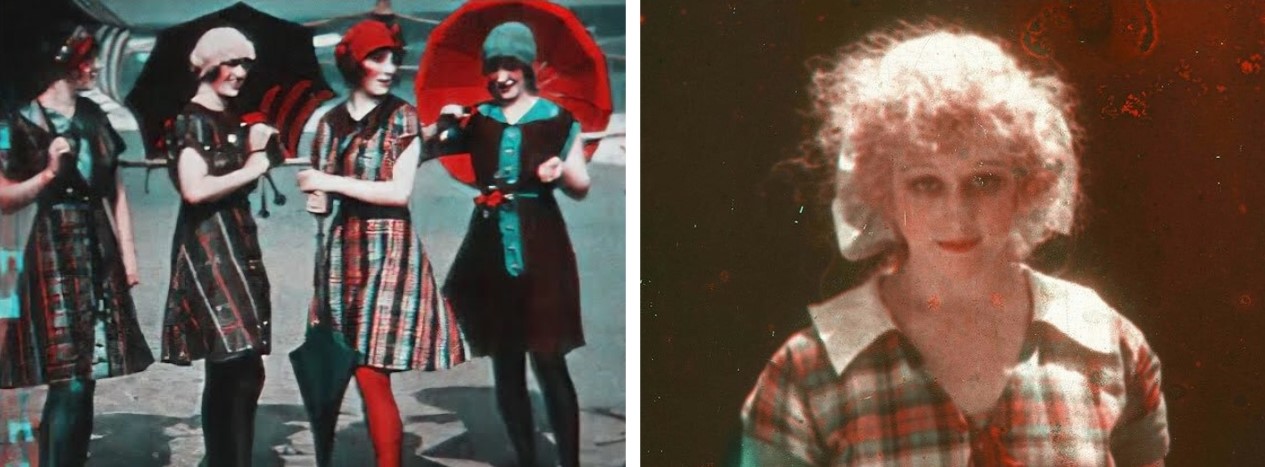
The efforts to join colour to the moving image are as old as cinema itself. At least since the release of Annabelle Serpentine Dance (1895) by the Edison Manufacturing Company, filmmakers had been hand-painting frames to add colour to black-and-white prints. In this 45-second short, Broadway dancer Annabelle Moore is dressed in white veils that appear to change colours as she swirls them. Hand colouring was often used in early European trick and fantasy films, especially those produced by pioneer French filmmaker George Méliès, who amazed audiences with his astonishingly intricate visual effects. Méliès first experimented with colour in Jeanne d'Arc (1900), leading to a more spectacular use of the technique in Le Voyage dans la Lune (1902) and Le Voyage à travers l'impossible (1904), which offers four hues in at least ten shades and tints simultaneously on screen.
Despite its artistic potential that could be further explored by filmmakers, hand-painted film died in its infancy. By the mid-1900s, the average length of motion pictures had increased and the number of exhibition venues demanding prints had multiplied, which made the process of colouring entire films frame by frame with a paintbrush economically unfeasible.
 |
| LEFT: Frame from Annabelle Serpentine Dance. RIGHT: Frame from Le Voyage dans la Lune. |
In an attempt to reconcile film colour with cinema's growing industrialization, Spanish director Segundo de Chomón developed a partially mechanized stenciling process for French production giant Pathé Frères in 1905. Pathécolor incorporated an original print of a film with sections cut by a pantograph connected to a needle, which cut out pieces of each frame. The resulting stencil was placed in contact with a second print of the film and the two prints were then run together under a roller saturated with colour ink or put in front of an airbrush. Early examples of stencil-coloured films include Les Œufs de Pâques (1907) and Excursion dans la Lune (1908), an almost shot-by-shot remake of Méliès's Le Voyage dans la Lune.
 |
| LEFT: Frame from Les Œuefs des Pâques. RIGHT: Frame from Excursion dans la Lune. |
Film tinting was widely used in early silent features, with specific colours employed for certain narrative effects. For instance, blue signaled night, red indicated fire and passion, magenta and lavender designated romance, green was used for nature and gruesome scenes, and amber indicated lamplight. American director D. W. Griffith displayed an interest in colour and utilized tinting to a unique effect in many of his features, including the three-hour controversial epic drama The Birth of a Nation (1915). The ease with which these techniques could be carried out resulted in colour permeating cinema more widely in the 1910s. By the beginning of the following decade, between 80 and 90 percent of all films were either tinted or toned.
 |
| Tinted frames from D. W. Griffith's controversial epic The Birth of a Nation. |
 |
| LEFT: Sample plat of tinted colour stock from Eastman Sonochrome Positive Film Tints. MIDDLE: An Eastman Sonochrome ad. RIGHT: A page from the Eastman Kodak manual showing some of the Sonochrome shades. |
In the United States, Herbert Kalmus, Samuel Comstock and W. Burton Wescott developed the Technicolor Process Number One, in which a prism beam-splitter behind the camera lens exposed two consecutive frames of a single strip of black-and-white negative film through two filters, one red and the other green. Because two frames were being exposed at the same time, exhibition called for a special projector with two apertures equipped with red and green filters, two lenses and an adjustable prism that aligned the two images on the screen. This requirement, as well as several technical deficiencies such as colour fringing, contributed to the ultimate failure of this additive colour process. The only feature filmed in Technicolor Process One was The Gulf Between (1917), starring Grace Darmond and Niles Welch.
 |
| LEFT: Frame from A Visit to the Seaside. RIGHT: Frame from The Gulf Between. |
The first full-lenght motion picture produced entirely in Technicolor Process Two was The Toll of the Sea (1922), followed by Wanderer of the Wasteland (1924) and The Black Pirate (1926). The process was also used to colour short scenes in such films as The Ten Commandments (1923), The Phantom of the Opera (1925) and Ben-Hur: A Tale of the Christ (1925).
 |
| LEFT: Frame from The Toll of the Sea. RIGHT: Frame from The Black Pirate. |
The first feature made entirely in Technicolor Process Three was The Viking (1928), which had a synchronized soundtrack. There followed such pictures as On with the Show! (1929), the first all-talking colour film, Gold Diggers of Broadway (1929) and King of Jazz (1930).
 |
| LEFT: Frame from The Viking. RIGHT: Frame from On with the Show!. |
Throughout 1930, two-strip Technicolor continued to be used for many entire features as well as to add colour to selected scenes, such as in Hell's Angels (1930) and Paramount on Parade (1930). By the following year, however, the Great Depression finally took its toll on the Hollywood motion picture industry, which began to cut back on expenses. As such, Technicolor had generally been abandoned by 1932, as it was three times more expensive than black-and-white photography. In addition, Technicolor faced mediocre quality control in the company's limited space. Many two-strip dye-transfer prints had apparent grain caused by improperly exposed matrices and reels with an inconsistent colour balance.
 |
| Frames from Hell's Angels. This is the only colour footage of Jean Harlow's career. |
The first feature to use three-strip Technicolor was Rouben Mamoulian's Becky Sharp (1935), a historical drama starring Miriam Hopkins, Frances Dee and Cedric Hardwicke.
 |
| Frames from Rouben Mamoulian's Becky Sharp. |
As colour found a niche within the film industry, Technicolor engineers worked to make their technology more flexible so that it could better match the standards of black-and-white photography. In conjunction, colour designers limited the palettes placed before the camera in favour of an emphasis on tone and value, qualities more agreeable with the dominant black-and-white practice. Soon, the vivid foreground displays of Becky Sharp gave way to a less obtrusive look that was considered more easily integrable with film narrative. This was referred to as the «restrained mode of colour design,» which aimed to achieve a coordination between hues and dramatic intention by emphasizing subtlety and the avoidance of high contrast.
The landmark film in the restrained mode was Henry Hathaway's The Trail of Lonesome Pine (1936), which was also the first three-strip Technicolor feature to be shot on an outdoor location. Based on John Fox Jr.'s eponymous 1908 novel, this Paramount release centers on a love triangle between coal-company engineer Jack Hale (Fred MacMurray), wild country girl June Tolliver (Sylvia Sidney), and her fiancé and cousin, Dave Tolliver (Henry Fonda). This romantic entanglement is complicated by a feud between the Tollivers and the Fallins, who inadvertently kill June's little brother Buddie (George «Spanky» MacFarland) in a bombing at his construction site. Dave eventually sacrifices his own life to end the violence between the families, opening the way for June to marry Jack, who has by now turned her into the sophisticated lady that she had always wanted to be. One of the top five highest-grossing pictures of the year, The Trail of the Lonesome Pine served as the model for a brief cycle of colour «ecology dramas,» which included Ramona (1936) and God Is Where You Find It (1938).
The landmark film in the restrained mode was Henry Hathaway's The Trail of Lonesome Pine (1936), which was also the first three-strip Technicolor feature to be shot on an outdoor location. Based on John Fox Jr.'s eponymous 1908 novel, this Paramount release centers on a love triangle between coal-company engineer Jack Hale (Fred MacMurray), wild country girl June Tolliver (Sylvia Sidney), and her fiancé and cousin, Dave Tolliver (Henry Fonda). This romantic entanglement is complicated by a feud between the Tollivers and the Fallins, who inadvertently kill June's little brother Buddie (George «Spanky» MacFarland) in a bombing at his construction site. Dave eventually sacrifices his own life to end the violence between the families, opening the way for June to marry Jack, who has by now turned her into the sophisticated lady that she had always wanted to be. One of the top five highest-grossing pictures of the year, The Trail of the Lonesome Pine served as the model for a brief cycle of colour «ecology dramas,» which included Ramona (1936) and God Is Where You Find It (1938).
 |
| Theatrical release posters for The Trail of the Lonesome Pine. |
For two weeks, Hathaway fought Technicolor executive Natalie M. Kalmus, ex-wife of the company founder, over how to photograph The Trail of the Lonesome Pine. Kalmus was the head of the Color Advisory Service, which guided the productions on how to develop a colour score in accordance with the narrative structure of a film. Sets and costume designs, props, make-up, lighting and even the camera work were all controlled by the Technicolor company.
After viewing the rushes shot on location at Big Bear Lake and Santa Susana Pass in Chatsworth, California, where the studio recreated the rural and mountain setting of the novel, producer Walter Wanger sided with Hathaway and ordered the Technicolor team to give the director whatever he needed. Hathaway recalled,
After viewing the rushes shot on location at Big Bear Lake and Santa Susana Pass in Chatsworth, California, where the studio recreated the rural and mountain setting of the novel, producer Walter Wanger sided with Hathaway and ordered the Technicolor team to give the director whatever he needed. Hathaway recalled,
«I wanted to make an authentic looking account of these pioneer people. [The Trail of the Lonesome Pine] was Paramount's first [outdoor three-strip process] Technicolor film and [...] nobody knew what we couldn't do. I had the cameraman [...] shoot directly into shadows, use half-light, do dawn shots, and the Technicolor consultant had a fit, claiming that everything had to be brightly lit. But [...] Wanger said to go ahead and these vignettes saved the picture.»
 |
| Frames from The Trail of Lonesome Pine, showing the mountain settings. |
Despite Wanger's claim that the production crew «let colours fall where they may,» the film's persistent avoidance of bright and saturated hues indicated an extraordinary attention to colour. Technicolor cinematographer William H. Greene, who worked on the picture, described the team's efforts to subdue colour:
«Whereas in many productions in times past, everything colourful that could be thought of was put before the camera, in [The Trail of the Lonesome Pine] people and places were photographed just as they really are. [...] Even red and black checkered shirts, which might well be found in the mountains, were not allowed because the effect might suggest that they had been added to bring out more colour.»
Instead, subtler motifs were preferred and colour was eased into the background so that «the audience will not be conscious of the fact that they are looking at colour. They will only see men and women going about the business of life looking real.»
 |
| Frames of The Trail of the Lonesome Pine, showing the characters wearing mostly gray clothes. The use of subdued colours made the scenes look more like real life. |
Whereas Becky Sharp indulged in highlights against a neutral background, The Trail of the Lonesome Pine deliberately avoided using accents, instead varying the neurals to create a more complex texture. Dominated by cabin interiors and woodland, the setting of Hathaway's picture is generally rendered in shades and tones of brown and gray; when other hues are present (mostly in green foliage and blue sky) they often possess a pronounced gray undertone. The film's design also combines details of flat, unsaturated colours to produce a varied — though neutralized — background for action. As such, hard colour contrasts are rejected in favour of a mixture of neutral (gray and beige) with analogous hues (red-rose and brown) of roughly constant saturation and subtly graduated brightness. Because of their saturation, the various colours are able to converge organically and contribute harmonized texture and visual interest to the shot without departing from a subdued design.
 |
| Frames from The Trail of the Lonesome Pine. The film's mise-en-scène is dominated by various shades of brown and gray, with other colours (mostly green and blue) emerging organically from the background. |
A restraint palette of closely related hues also allowed for colour patterns and motifs that accrue meaning across a film to stand out more easily on screen. For example, June's costumes become more colourful as she falls in love with Jack. In the first half of the film, she appears in a nearly black Majolica Blue ensemble that includes a knit skirt and a short-sleeved blouse. Later, she tries to impress Jack by adding a cape and a white lace collar to the dress. She finally discards this outfit when, as she leaves town for a city education, she wears a gray plaid dress, a gray cape and a straw hat decorated with a black and red-brown band, the most striking element in this attire. Following her brother's death at the end of the film, June returns home in a Stone Green hat, skirt and tailored coat, which she wears over a brown shirt, her attempt to emulate Jack's idea of sophistication. These costume changes introduce colour variation without departing from the palette and are crucial to character development.
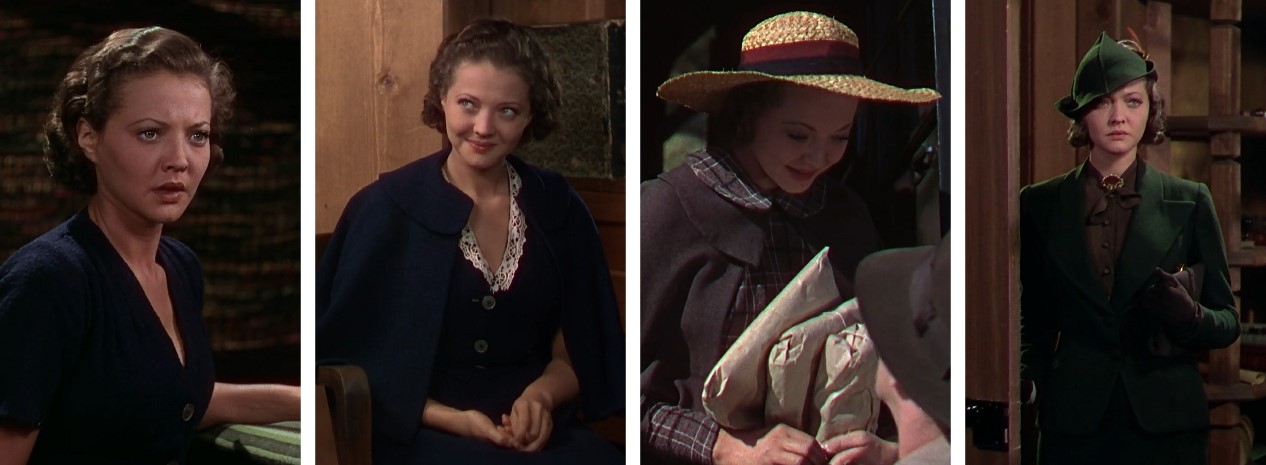 |
| Frames from The Trail of Lonesome Pine, showing the evolution of June's costumes. |
The emotional use of colour in The Trail of the Lonesome Pine peaks during Buddie's funeral, which is preceded by arguably the most strinking shot in the film: a brief view from above a blank of clouds gathered around a distant mountain peak and reflecting bright orange sunlight. In the subsequent shots of the funeral party, mist covering the background veils the forest in a gray cast, neutralizing hues and accentuating shadows and rays of sunlight. Yet, at the center of the gathering, a pile of orange leaves covers Buddie's bier. The orange-red accent is brought to the foreground by framing June's parents (Fred Stone and Beulah Bondi) and then the preacher (Frank McGlynn Sr.) from behind the casket. The foliage serves not only to remind viewers of the coffin's location and mark the season, but also to reinforce emotional effect in the scene.
 |
| Frames from The Trail of the Lonesome Pine, showing Buddie's funeral scene. |
Undoubtedly, the major attraction of The Trail of the Lonesome Pine lay in the presentation of spectacular landscapes in so-called «natural colour.» Apparently, one Brooklyn exhibitor forced pine extract through the air conditioner and advertised the showing as «so realistic you'll smell the odor of the pine,» illustrating just how important natural settings were for the marketing of the film. Greene emphazised the point by boasting that the production «is made up largely of exteriors, vast sweeps which thrill you with their beauty. Shot with a colour process that gives you the ultimate in natural colour reproductions, these exterior scenes will give the public what it long has been wanting — naturalness.»
Despite the use of «natural colour,» restraint still prevails in most of the exterior footage. An example of colour restraint in an outdoor scenery occurs in the montage of the progress made by Jack's employees, where the only vivid hues are glimpses of blue sky above the brown and green tones of the work site. Workers are clad almost entirely in brown and gray, with few men in subdued blue shirts adding variation to the color design. The same principles rule more strictly atmospheric scenes. For instance, in a sequence showing the passage of winter, colour progresses from near monochrome in the snowy season through the soft gradations of gray and brown during the thaw, culminating in the vivid pastels of the sky and clouds. Again, this gentle accents of colour add texture to the film without deviating from the tight palette.
Despite the use of «natural colour,» restraint still prevails in most of the exterior footage. An example of colour restraint in an outdoor scenery occurs in the montage of the progress made by Jack's employees, where the only vivid hues are glimpses of blue sky above the brown and green tones of the work site. Workers are clad almost entirely in brown and gray, with few men in subdued blue shirts adding variation to the color design. The same principles rule more strictly atmospheric scenes. For instance, in a sequence showing the passage of winter, colour progresses from near monochrome in the snowy season through the soft gradations of gray and brown during the thaw, culminating in the vivid pastels of the sky and clouds. Again, this gentle accents of colour add texture to the film without deviating from the tight palette.
 |
| Frames from The Trail of the Lonesome Pine, showing the passage of winter. |
The Trail of the Lonesome Pine certainly excels at developing the potentials of a restrained palette, but in one particular moment overtly stylizes colour by calling attention to it. During a telephone love scene between June, now in her room at a Louisville boarding school, and Jack, who is in his makeshift field office, the frame explodes with stunning pastels. In the first shot of June in her hypereffeminate bedroom, she reclines in Pink Mist pyjamas on off-white bedding tinted a very light shade of pink. Beyond her is a set of frilly light pink curtains against a wall covered in blue-green paper with a pink floral pattern. The pink and green hues, as well as the ornamentation of curtains and flowers, dramatically depart from the film's rough mise-en-scène.
More surprisingly, the overt colour unexpectedly spills over into Jack's field office. As the couple flirts during their conversation, Jack begins playing with a set of coloured pencils that sit before a portrait of Sylvia Sidney on his desk. A series of insert shots then show Jack using a blue pencil to rearrange red, blue and green pencils in front of her photograph. As he compliments June's eyes and asks her if she has a dimple, Jack arranges the pencils in a V shape to frame the portrait and points to her chin with the blue pencil. This momentary expansion of the palette is part of the pattern that connects colour to June's feminization and Jack's growing attraction to her. True to the dominant style, however, colour design still relies on the careful arrangement of a few hues (pinks and blues) and avoids deep and saturated shades.
More surprisingly, the overt colour unexpectedly spills over into Jack's field office. As the couple flirts during their conversation, Jack begins playing with a set of coloured pencils that sit before a portrait of Sylvia Sidney on his desk. A series of insert shots then show Jack using a blue pencil to rearrange red, blue and green pencils in front of her photograph. As he compliments June's eyes and asks her if she has a dimple, Jack arranges the pencils in a V shape to frame the portrait and points to her chin with the blue pencil. This momentary expansion of the palette is part of the pattern that connects colour to June's feminization and Jack's growing attraction to her. True to the dominant style, however, colour design still relies on the careful arrangement of a few hues (pinks and blues) and avoids deep and saturated shades.
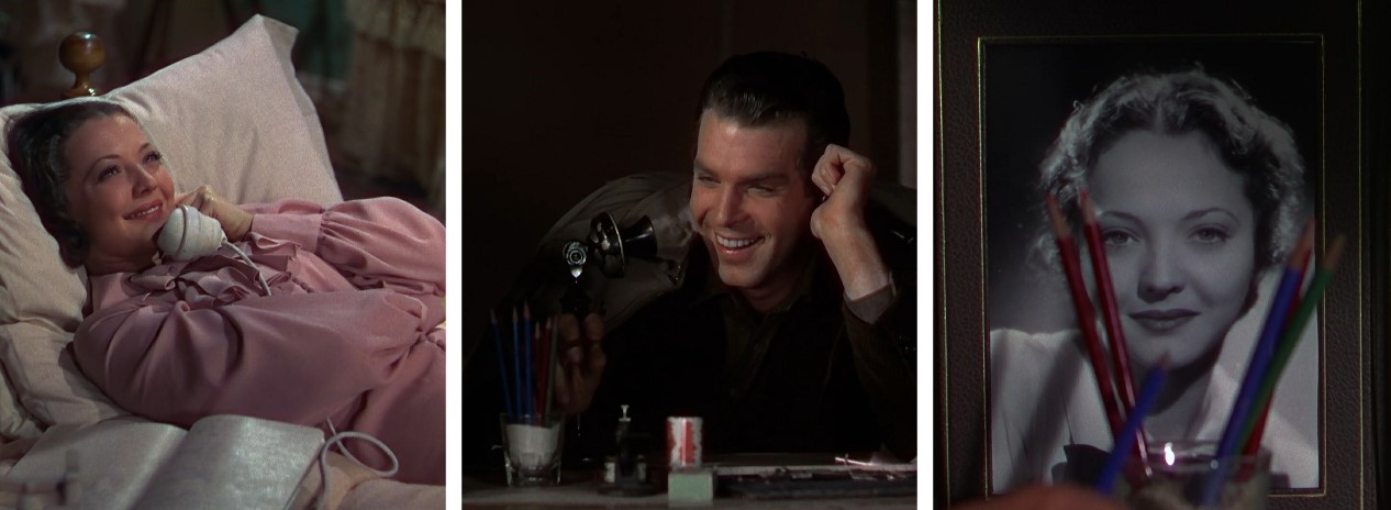 |
| The telephone love scene between June and Jack in The Trail of the Lonesome Pine. |
Adhering to a narrow coordinated colour palette opened new possibilities for tying hue with story. Like lighting or music, colour offered an additional register through which to establish motifs, set mood and highlight narrative and character development. Following The Trail of the Lonesome Pine, films like A Star is Born (1937) and Nothing Sacred (1937) continued to make use of this method to correlate chromatic shifts with narrative structures. However, the antagonism between supporting the story unobtrusively while showcasing Technicolor as an «added attraction» contributed to the eventual decline of the restrained mode. By the end of the decade, it had been eclipsed by the «complex and assertive» displays of colour of films like The Adventures of Robin Hood (1938), The Wizard of Oz (1939) and Gone with the Wind (1939). But even these films built on the methods for integrating and controlling colour that had been formed within this extraordinarily important, though nearly forgotten, mode of design.
This post is my contribution to The Classic Movie History Project Blogathon hosted by Movies Silently, Silver Screenings and Once Upon a Screen. To view all entries, click the links below.

______________________________________________
SOURCES:Harnessing the Technicolor Rainbow: Color Design in the 1930s by Scott Higgins (University of Texas Press, 2007)
Henry Hathaway: The Lives of a Hollywood Director by Harold N. Pomainville (Rowman & Littlefield, 2016)
Moving Color: Early Film, Mass Culture, Modernism by Joshua Yumibe (Rutgers University Press, 2012)
Moving Imagine Technology: From Zoetrope to Digital by Leo Enticknap (Wallflower Press, 2005)
Technicolor Movies: The History of Dye Transfer Printing by Richard W. Haines (McFarland & Company, Inc., 1993)


So many thoughts on your fab post, so here they are in random order...
ReplyDelete1. Loved the Seaside colour footage from. So vivid!
2. It was interesting to learn how different colours were achieved.
3. I did not know the 1st Techncolor film was made in 1928.
4. The Lonesome Pine film sounds intriguing, but all the more so taking into account the realistic use of colour. I'm glad filmmakers resisted the temptation to be over the top.
Thank you for joining the blogathon and teaching us (me) more about the early history of colour film. :)
Thank you so much for reading. :)
DeleteI enjoyed your survey of the history of color. I remembered that Trail of the Lonesome Pine looked different compared to contemporary Technicolor movies. Now I know why.
ReplyDeleteWoman, Im here applauding this wonderful piece. Congratulations, I'm fascinated by the history of color movies and I still have a lot to learn - I had never heard of sonochrome before.
ReplyDeleteAs for The Trail, I loved how they used the colors for moods and gave the film a fresh look - it's difficult to say it's 80 years old.
Don't forget to read my contribution to the blogathon! :)
Kisses!
Le
http://www.criticaretro.blogspot.com
Wonderful blog entry! Thanks for clarifying the timeline of some of these intermediary processes for me (the films shot in Technicolor Process Two), and also the shot of the film tint sample plate (!). This seems to be fairly exhaustive in its scope, really appreciate it.
ReplyDelete